L'article
Lead Generation and Contact Form: 5 Tips for Optimization
Shunned by web users and criticised by user experience aficionados, the contact form has endured on landing pages, inbound blogs and contact pages, acting as a “necessary evil”. It has to be said that companies haven’t yet found a better way of collecting contact information from their leads. In this practical guide, the editorial team offers 5 golden rules to ensure that your contact forms don’t get in the way of the buying process.
1- Adhere to Common Sense UX Principles
It’s simple: your contact form must be intuitive, short and optimised for your data collection objective. Checklist :
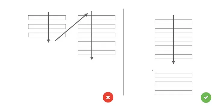
- Size the form fields according to the size of the expected response. This study, based on eye-tracking, showed that forms whose fields were the same size as the expected response were filled out much more than others.
- Organise your form in a single column. Multi-column forms can be confusing, with an inverted “Z” or “N” path. With a single column, the path is obvious, intuitive and straightforward. This study supports this view;

- The order of the questions must be intuitive and logical for the user, not for your database. The flow should be natural and conversational;
- Place labels above the corresponding input fields (rather than to the left or below). This study explains that fields labelled from above are easier to understand and scan. Another advantage is that this configuration reduces the width of the form, which improves the mobile experience.

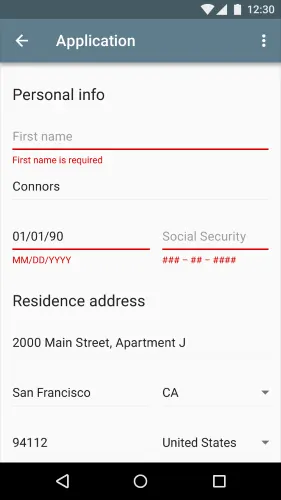
2- Error messages, a major point of vigilance
In an ideal world, visitors to your website would fill in your contact form on the fly, without friction. In practice, users can make mistakes, and you need real-time assistance to avoid losing the lead. And that inevitably means real-time validation and error messages. The 10 principles of usability manifesto state that errors must be communicated “elegantly, effectively and clearly“. Here are a few tips:
- The error message should be displayed at the right time, just after a field has been completed. Do not delay the message until after the form has been submitted;
- Avoid displaying the message in real-time. Some forms display an error message by default under the field to be filled in and only make it disappear once the expected response has been entered. This bad practice, which is both frustrating and “negative”, is common for fields such as “telephone number” or “email address”;
- If the user makes a mistake in filling in a field, don’t delete the other answers. This would guarantee abandonment and a lost lead;
- If the answers are expected in a specific format, indicate this in advance, below the field, in a different colour.

3- Offer autofill functionality
Autocomplete, or autofill, consists of proposing an answer or automatically filling in a field based on previously recorded information, usually using a native or third-party application. According to Google, forms with autofill functionality are 30% faster to complete than others.
For your part, you need to ensure that the fields in your form have the right values, attributes and IDs. The user’s browser will then be able to suggest answers for all the fields (first and last name, address, email, telephone number, payment information, etc.).
4- Limit the number of fields to be completed
For the user, completing a form is a tedious and unproductive task. Inevitably, forms with ten or so fields and several steps are the most likely to be ignored or abandoned. Limit yourself to the fields that are useful to you in your lead nurturing process. Do you really need to know how the lead heard about your company?
5- ReCAPTCHA is better than CAPTCHA
reCAPTCHA is Google’s version of the famous CAPTCHA, a technology that aims to distinguish human users from spammy bots. reCAPTCHA uses advanced artificial intelligence to provide a more seamless experience for human users while being more effective at blocking bots.
reCAPTCHAs are easier to solve since they are limited to ticking a box, selecting images according to a clear criterion or performing a very simple action, unlike traditional CAPTCHAs which require the user to enter distorted text that is particularly difficult to read and confusing. In a traditional CAPTCHA, the user will not be able to distinguish between the zero ‘0’ and the letter ‘O’, or between the lower case letter ‘L’ and the upper case letter ‘i’.